
Dog Walker App – Design Challenge
Problem Identification
Help a dog owner find a trusted dog walker, either for a single visit or multiple visits.
Design Process
• Research: Primary & Secondary
• Requirements Identification
• Low Fidelity Wireframes
• User Interface Design
Research
Primary
Initially, this design challenge excited me because I am a dog owner myself, but because my dog comes with me everywhere, I have yet to need dog walking services. Before designing the dog walker app from strictly imagination, I spent a few minutes interviewing dog owners who use dog walking services. The information I sought out included provider qualities that the owner found important: knowledgable, has veterinarian experience, and highly recommended.
Other information I was able to gain from these interviews was that the owners liked being left with end-of-visit notes about their dog's walk, and that they could customize the walks based on their dog's needs. These owners came up with a few interesting ideas, such as routing the walk, notification of start and end of walking session, and attaching a photo or video from the session.
Secondary
My secondary research included a basic inventory of apps and websites for dog boarding services, child care services, and auto maintenance services. Researching a dog boarding booking process allowed me to see what add-on services a dog walker might also be able to provide a dog on a daily visit (more treats please!). The childcare apps gave me insight into scheduling methods and other details that might be important to the owner, like a short bio and list of qualifications. Looking at maintenance scheduling for a vehicle gave me additional insight into selecting an appointment slot and customizing the services requested.
Requirements Identification
After doing the light research, my next task was to begin a list of requirements to consider and explore in the design phase. There were four required functions of this design challenge:
Function A: Find a dog walker
Function B: See their schedule
Function C: Book a time
Function D: Rate the walker
With these primary functions in mind, I started listing sub-functionality for these functions (Example: Function A should provide the name of the provider, rating, photo, cost, abilities, and city).
Low Fidelity Wireframes
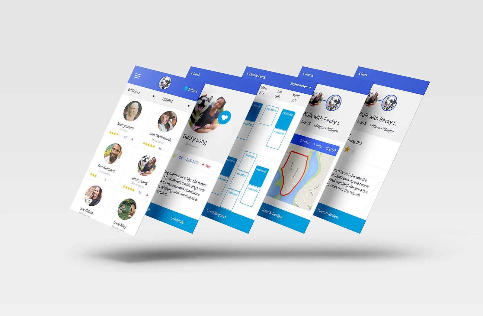
Writing the list of requirements was a helpful first-step towards design, but it was not until sketching the wireframes on paper that I was able to work through my ideas and distill the logic around the primary functions. While sketching the different pages, I worked through a several different layout treatments of the pages and/or components. My execution of the four primary functions evolved into five screens:
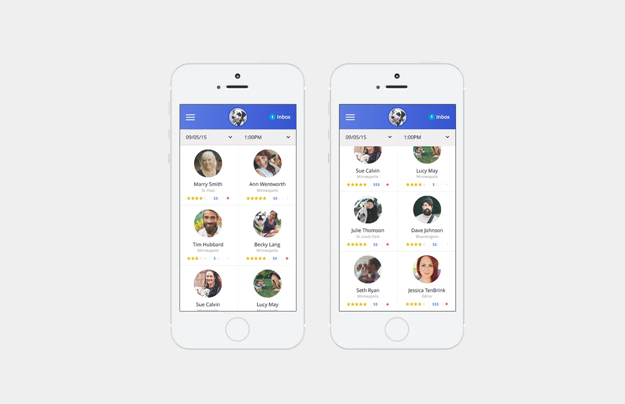
Screen One: List of Providers (Function A)
The list displays nearby providers which can be filtered by available dates and times.
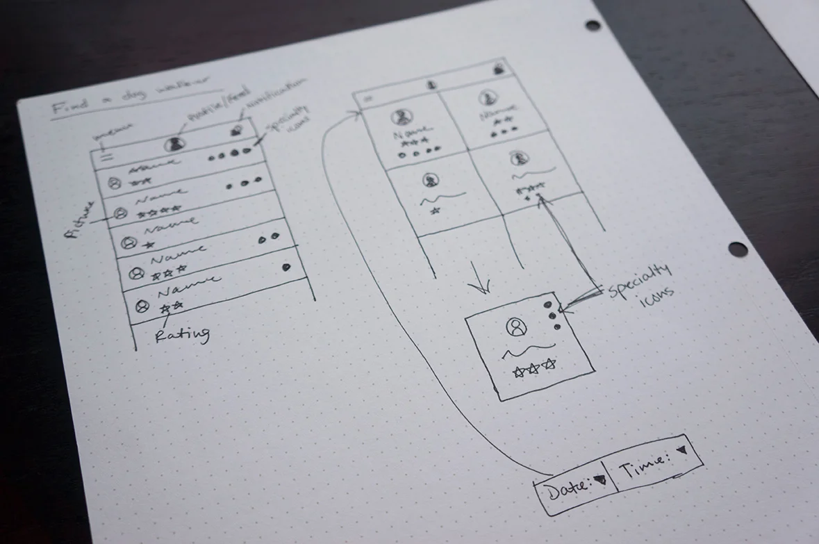
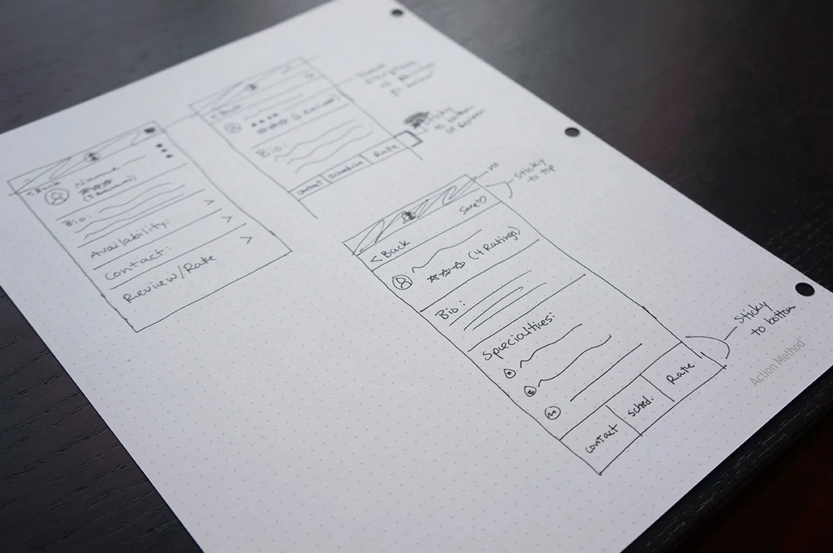
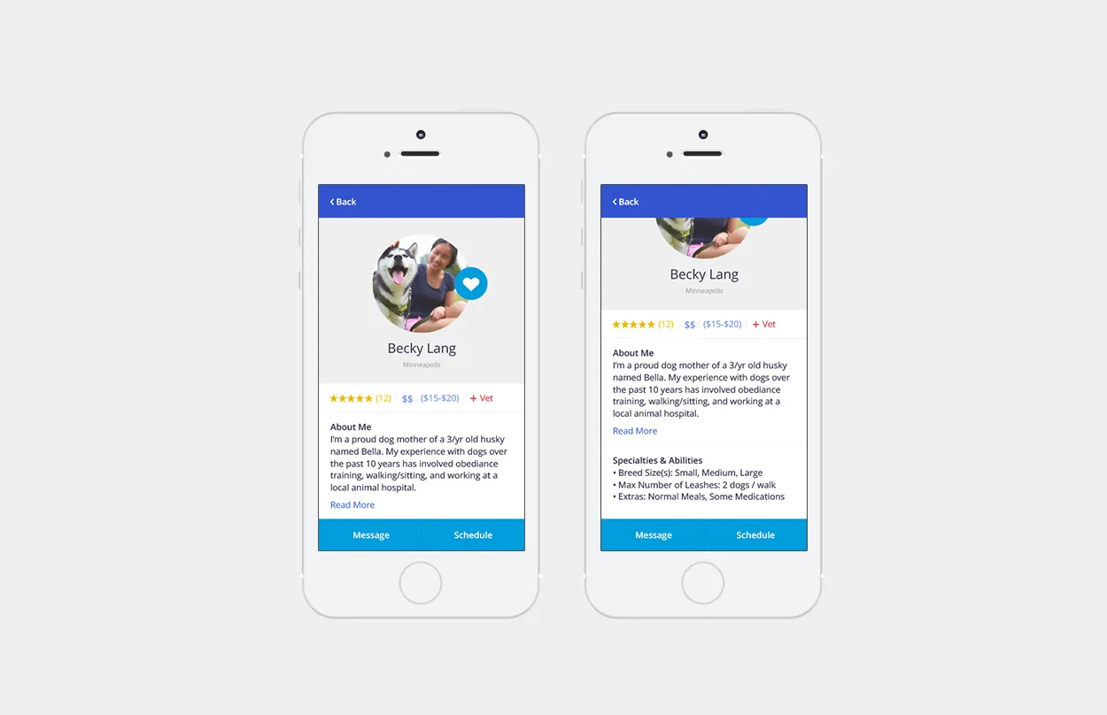
Screen Two: Provider's Profile (Function A & B)
Displays details about the provider and functionality to save the provider, contact provider, and view the provider's schedule.
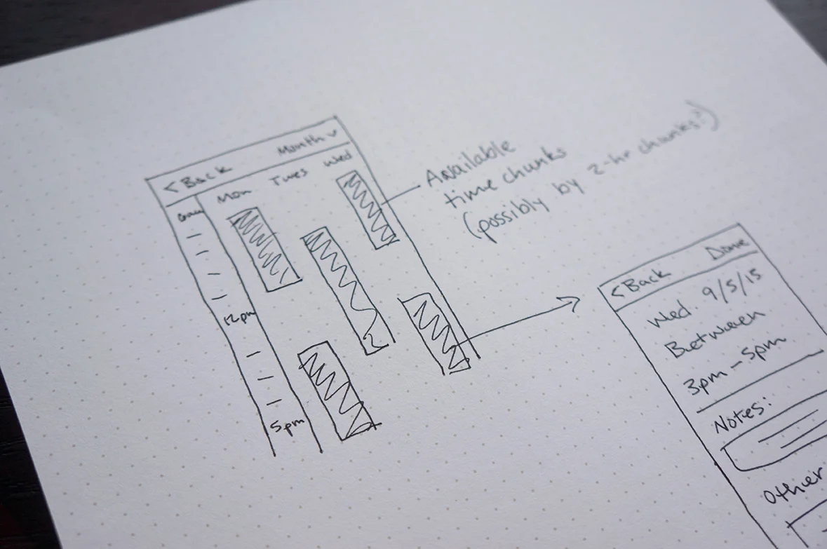
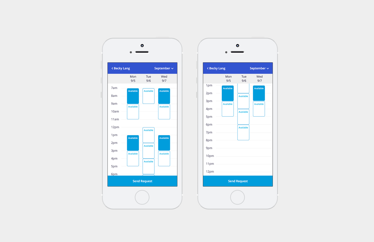
Screen Three: Provider's Schedule (Function B & C)
Allows the user to select multiple time slots, and scroll through hours, days, and months.
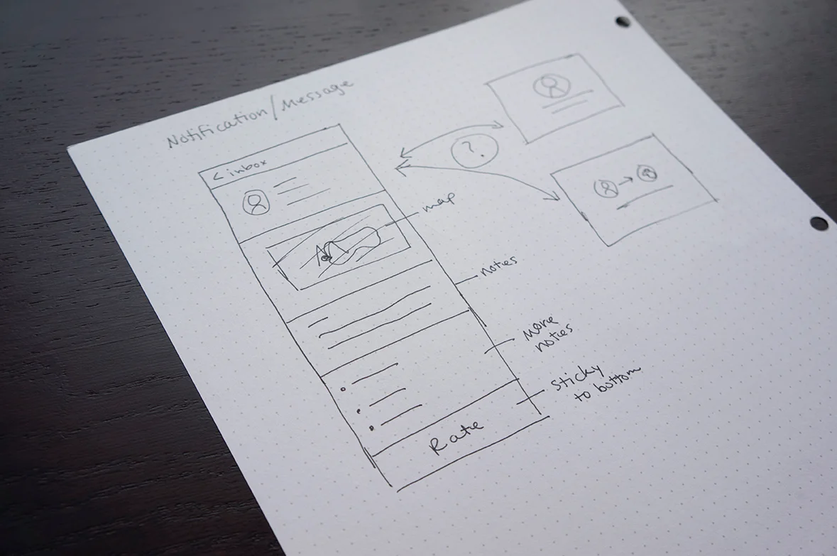
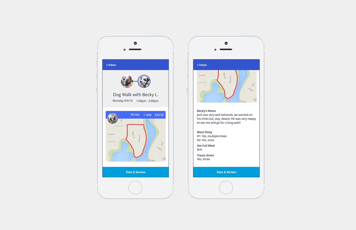
Screen Four: End of Visit Report (Function D)
Provides user with session route, session notes, session photo, and functionality to rate the dog walker.
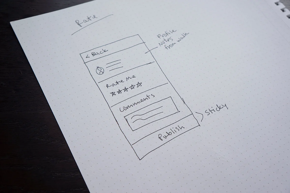
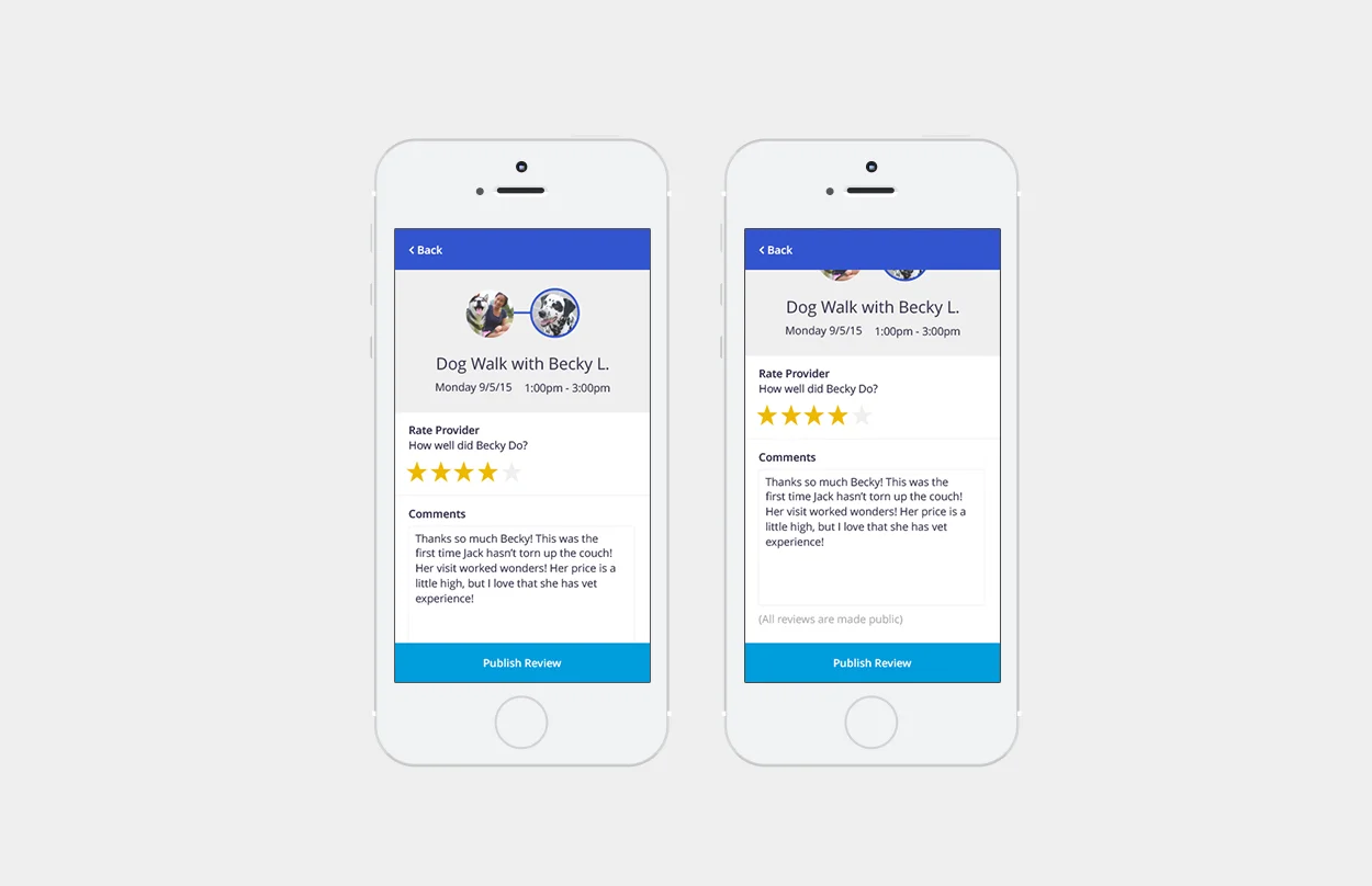
Screen Five: Rate & Review Provider (Function D)
Gives the user the opportunity to give a star rating of the provider, as well as write a review about the experience.
This quick wireframe sketching exercise helped me think through each layout and functionality decision before getting into the weeds of the visual design phase.
Challenges I worked through included:
"How could a user select a date & time preference before diving into the wrong provider's schedule?"
"How would the user encounter these filtering options without adding another screen?".
"How would the owner communicate instructions on how to enter the home? Do I need to account for that here? Let's say it's all wrapped into the profile preferences for now…"
User Interface Design
My first step in the UI design process was opening Sketch and selecting iPhone 6 artboards to work in, which set me up nicely to view my working document live on my own phone via Sketch Mirror app. After initial document setup, I began my color identification and selection process. I have a few methods of selecting color schemes, but each method begins with color psychology. From past projects, I know that blue is a great representation of trust, honesty, loyalty, reliability and responsibility; all of these qualities I wanted to be represented in the design with use of color. Knowing the color blue was my starting point, my next step was to go to the web app Coolors to begin my color scheme discovery, and selection process.

From an aesthetic perspective, my intention was to design the app to feel clean, airy, friendly, and thoughtful in its details. Use of the color scheme was also deliberate; for example, I chose to only use the bright aqua blue to represent highly actionable functions on each screen, which stands out from the primary blue within the system.
Screen One: List of Providers
A user profile bar sits sticky at the top of the screen, displaying a profile picture (owner or dog), main menu navigation (for settings, profile, etc.), and a shortcut to user inbox and notifications. Additionally, the filtering functionality allows the user to select a preferred date and time, which updates the provider list, showing only available providers matching the filtering criteria. The 2-column tile grid design allows several provider listings to be displayed, while also allowing for an engaging hierarchy of content within each tile. The large provider photo lets the user get an adequate visual of the provider, and is followed by the provider's name and iconography overview of the provider's profile.
Screen Two: Provider's Profile
The provider's profile highlights information about the provider that might be useful to the user. From here, the user can gain a details about the provider, such as typical cost, bio, relevant capabilities, and read past user's reviews. Primary functions on this screen are the ability to message the provider directly within the app, and to view the provider's schedule. Additional functionality allows the user save the provider to their profile for later, and navigate back to the provider list page.
Screen Three: Provider's Schedule
The provider's schedule displays availabilities of three days in a single view. To schedule the provider, the user can select multiple slots across multiple days. The 2-hour slots are a flexible timeframes that the provider can be scheduled to arrive within, but it may not be representative of the entire duration of the session (drive time, etc.). Primary functions on this screen include selecting appointments and sending a request to schedule dog walks. Additional functionality includes scrolling through hours, days, months, and returning to the provider's profile.
Screen Four: End of Visit Report
When the dog walk session is completed, the user is notified and provided with details about the session. As a reminder to the user, the session notes include the provider's photo, name, scheduled date, and scheduled time. Following the scheduled details, the report displays actual duration of session, cost of session, and distance walked during session. In addition, the report provides a map of the route walked, accommodates for a session photo, notes about the visit, and additional details about the session. Primary functions on this screen are to Rate & Review the provider, and go back to the user's main inbox.
Screen Five: Rate & Review Provider
After the session, if the user selected to rate and review their experience with a provider, this screen allows the user to rate the provider on a five-star rating metric, as well as write comments about their experience with the provider. All published feedback is made public within the app and will contribute to the provider's overall rating and reviews.
Thank you! Feel free to play with the design in a scrolling environment: